Inflation Melts: The Evidence And Implications
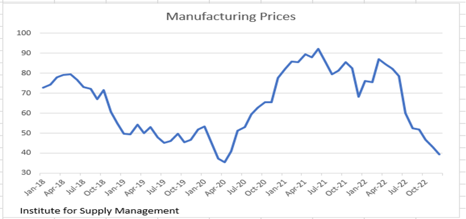

Manufacturing Prices
Universal Value Advisors
The CPI for December was released on January 12th (-0.1% M/M; +6.5% Y/Y). As it turns out, inflation was transitory after all – the time frame was 18 months. Supply chains are back to normal, and we see evidence of falling prices everywhere we look. The ISM survey of prices paid in the manufacturing sector (39.4 December vs. 43.0 November) is approaching the lows reached during the Covid lockdowns in April 2020, and they are significantly below the pre-Covid years shown on the chart above. Clearly deflationary.
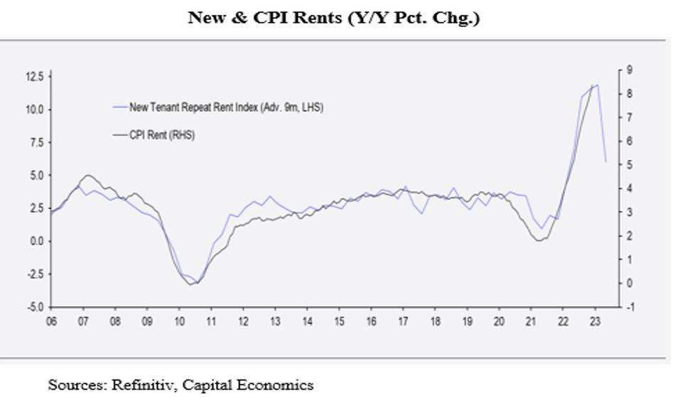
New & CPI Rents
Capital Economics, Refinitiv
In the December CPI print (-0.1%), shelter costs (mainly rents), which account for approximately 30% of the CPI, rose +0.8%. We know that the BLS uses antiquated methods when measuring rents, and we know that in real time, rents have been falling. BLS’s rent data are about nine months behind reality as seen from the tight fit of the CPI Rent Index to the New Tenant Repeat Rent Index advanced nine months (see chart above). If this tight relationship continues to hold, the CPI Rent Index is at or near its peak. Thus, future CPI releases won’t be bloated by the lags in BLS’s current methodology. (The CPI rent index still won’t reflect reality, but, at least for a time, the downward pressure on rents will be recognized.)
The math says that if rents rose +0.8% in this calculation, then, given its 30% weight in the CPI calculation, to get to the -0.1% overall figure, the net of all other prices combined had to decline by nearly -0.5%. That’s real deflation!
Other Inflation Data
Other data confirm our deflation hypothesis. The ISM survey shows order backlogs near the 2020 lockdown lows (left side of chart) with supplier delivery delays significantly below those of the lockdown and pre-lockdown period (right hand side of chart).
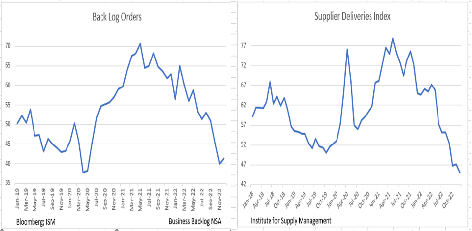
Back Log Orders and Supplier Deliveries Index
Universal Value Advisors
Continuing with this line of thinking, the left side of the chart below shows the steady downtrend in new orders, while the right-hand side shows the meltdown now ongoing in used car prices (i.e., the original poster-child for the current spate of inflation).
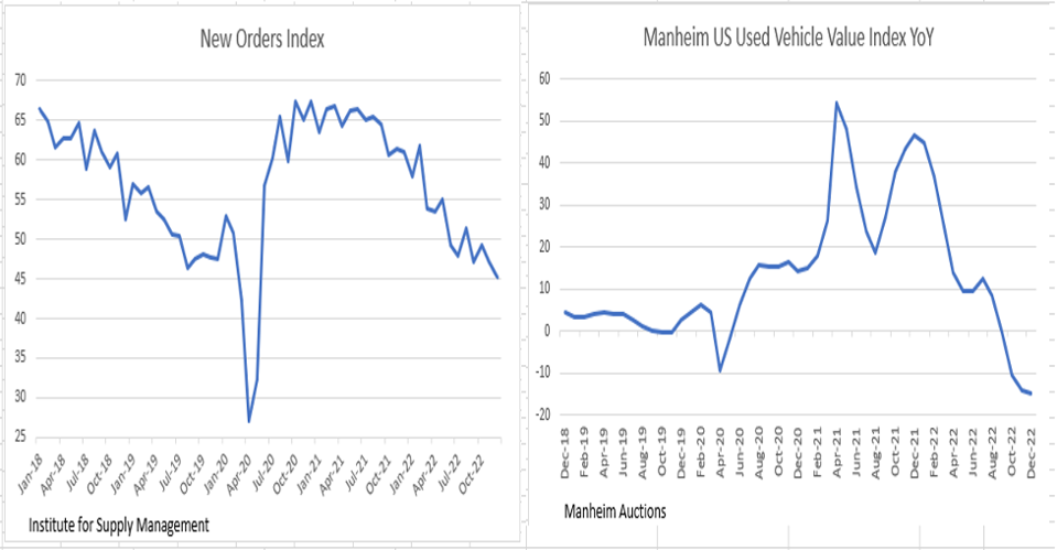
New Orders Index & Manheim US Used Vehicle Value Index
Universal Value Advisors
Over the past months, we’ve commented on the price softness emerging in the existing home sector. The next chart shows that the percentage of homes selling above asking price has fallen to near normal levels, another sign of easing price pressures. We believe that over the next few months, this data point will fall significantly below its long-run 20% mean.
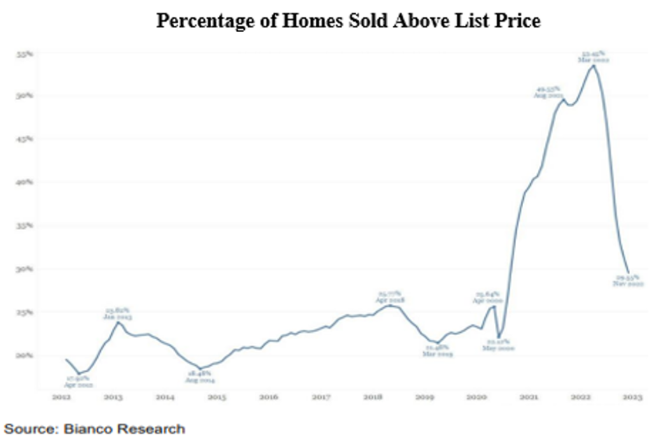
Percentage of Homes Sold Above List Price
Bianco Research
Over the last six months, rents in once hot markets have fallen: by -3% in Las Vegas, by -2% in Phoenix, and by -1% in Tampa. Part of the reason is the 400K new apartment units that came on the market in 2022. Given that 2023 is on track to produce more than 500K new units (see chart below), rents have a considerable distance to fall, and that will play a role in steering monetary policy in this year’s second half.
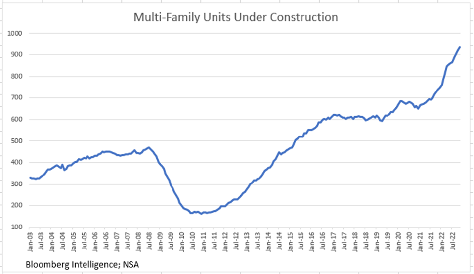
Multi-Family Units Under Construction
Universal Value Advisors
Where Is Inflation Going?
We did a thought experiment calculating what Y/Y inflation will be over the next few months at different monthly rates of change in the CPI.
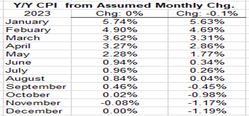
Y/Y CPI from Assumed Monthly Chg
Universal Value Advisors
The table shows two such results – one result if monthly inflation is 0% every month, and another result if it is -0.1%. Now, we think that, due to the rents component catching up to reality, disinflation will be lower than -0.1%. But even with these conservative assumptions, the Table shows that, by the May/June period, inflation will have melted away and be at or below the Fed’s 2% target. That’s really good news, and it likely means that interest rates will begin to retreat.
Bonds and Stocks
The chart shows a 49-year plot using the Bloomberg Treasury Total Return Index plotted against the S&P 500’s return for the same year. The upper right-hand quadrant contains the data points where both stocks and bonds produced positive returns. This quadrant contains nearly 70% of the years (34 of them).
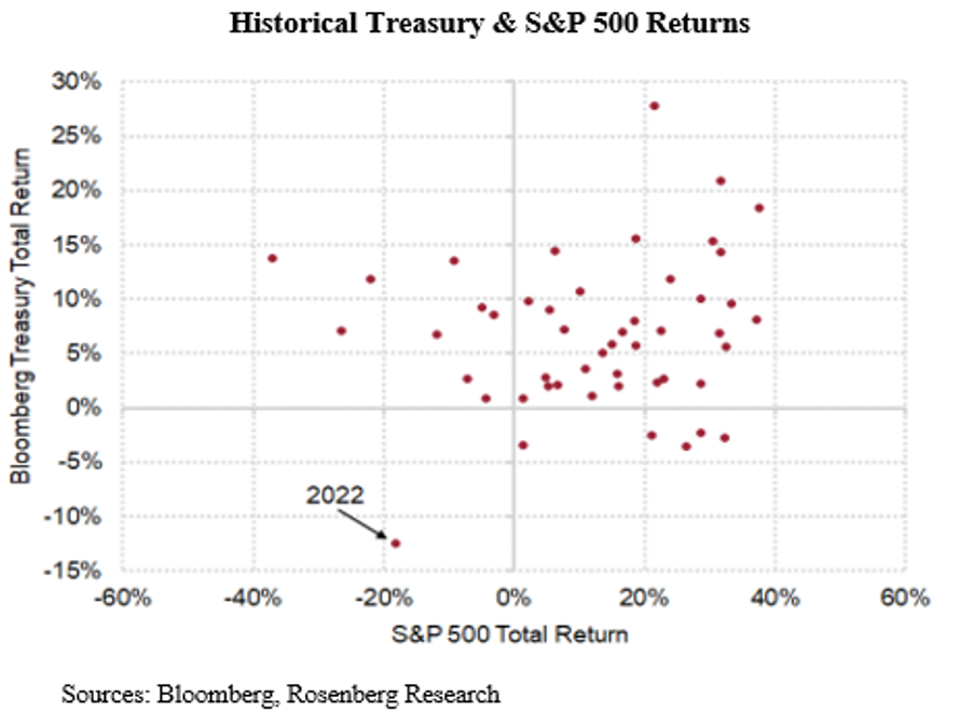
Historical Treasury & S&P 500 Returns
Bloomberg, Rosenberg Research
The upper left-hand quadrant shows years in which equity returns were negative, but bond yields were positive (9 such years). There are six years of the 49 in which bonds had a negative return while stocks were positive (lower right-hand quadrant). And then there is the single lonely dot in the lower left quadrant indicating the year in which both stocks and bonds had negative returns (both double digit). That dot represents last year (2022) and it appears to be abnormal. In the 14 years in which either stocks or bonds had a negative return (lower right and upper left quadrants), the other had a positive return. 2022 clearly is an outlier.
Blame it on the Fed! The data in the scattergram above include the 1980s when the Fed, under Paul Volcker, raised interest rates to the high teens to combat the inflation that had become endemic in the 80s. During that period there were no years in which both stock and bond returns were negative.
Final Thoughts
It wasn’t that long ago (2010-2019) when the Fed couldn’t get the rate of inflation to rise to its long-term 2% goal. That’s because demographics and technology have brought us to a deflationary world. It was the break in the supply chains that started the current spate of inflation, and that part of the inflation was, indeed, transitory! But the Fed itself compounded that initial supply inflation by monetizing the federal money giveaways in 2020 and 2021. As we have pointed out in prior blogs, the growth in the monetary aggregates in those years was high double digits.
Contrast that to today – the fastest rise in interest rates since Volcker, and, at the same time, contracting monetary aggregates. (We should point out that Volcker began easing rates at the first sigs of economic softness. He did not wait for the Y/Y rate of inflation to fall to a pre-conceived acceptable level.)
In its last set of minutes, the Fed admitted that their new “transparency” (i.e., signaling to markets where the FOMC predicts rates will be) has issues as we approach the end of the rate hiking cycle. This is due to the fact that the financial markets have begun to anticipate a move toward ease sometime this year and are moving markets in that direction, contrary to the Fed’s wishes. Since the new year began, as of Friday January 13, the 10 Yr. Treasury yield has melted from a 3.88% yield to 3.51% (down 37 basis points) while the 2 Yr. fell from 4.42% to 4.24% (18 basis points). Both of these are large moves in a short period of time. Even at this early stage in the new year, we think it is safe to say that the 2023 dot will not be in the lower left-hand quadrant of the chart above. Yes, the yield curve is still inverted (short-term rates higher than long-term; a signal of Recession), but markets now know that current Fed’s uber-hawkishness is simply a façade to keep markets from moving rates lower before the Fed deems fit. Thus, even after only two weeks into the new year, we think it is safe to say that the 2023 dot in the chart above will not be in the lower left-hand quadrant. As we have concluded in our last few blogs: “BAAA” (say it out loud!) (Bonds Are An Alternative).
(Joshua Barone contributed to this blog)